The most extreme design in the 3C digital category
Has extreme insight into the digital category, especially digital and technology details page, independent station design, has a very systematic knowledge and insight. Especially in Anker's various DTC brands, which have been very successful.
We first need to identify the product type, only then we can start doing the design. Typically, we categorize users in two ways in the digital space.
The first is the type of purchase decision.
- Appearance users, also known as face-value oriented users.
- Brand users, brand trust is strongest when it comes to purchasing decisions, prioritizing the purchase of recognized brands, or the need to be a branded product.
- Functional users, and usually cost-effective users, care about being feature-oriented and want to get the most features for the least amount of money.
- Word-of-mouth users, who look to the recommendations of others, and for whom word-of-mouth and reviews are the primary basis for decision-making.
The following four colors serve as a distinction in decision logic. The following are cases:
The screen display is great eh
Endorsed by my favorite Idol
This cell phone is too hot.
Oh, my God! The selfies look so good.
The photo effect is too strong, right?
I can't believe it's co-branded with XX brand
I only buy cell phones at this price.
As soon as I can use this brand
That's all I'm looking for.
I'm used to the system.
Just play the game fast.
Don't waste my time.
What's that? Okay, that's it.
It seems to be cheaper to buy from the official website
This feature compares favorably
The configurations seem to be similar.
Is this brand or that one better for taking pictures?
It's so expensive, it's a little bit exciting.
The price drop seems pretty good.
There's a freebie. Seems like a good deal.
It's on sale now. It's the best deal.
I didn't bother to choose. I just picked something.
Little Red Book says it's good
You can buy whatever you want.
XXX recommends it.
😊 Note: The percentage of users in each decision orientation changes across scenarios and categories
The chart below shows a display of our user share analysis of existing products.
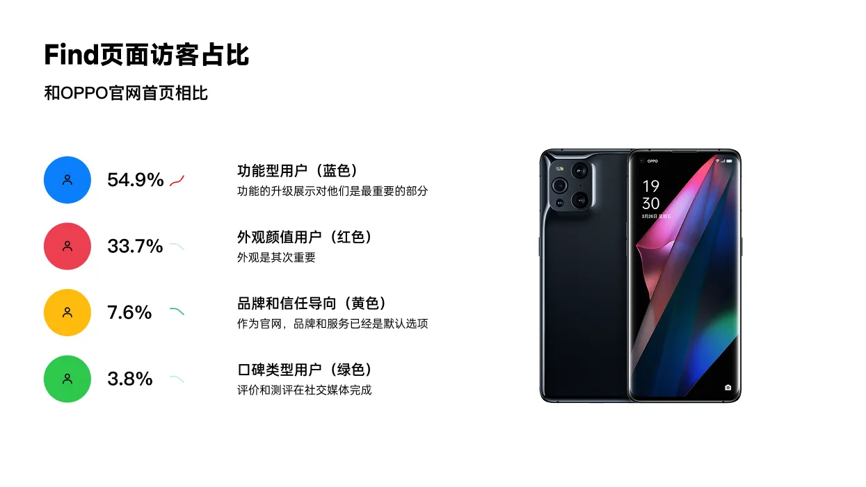
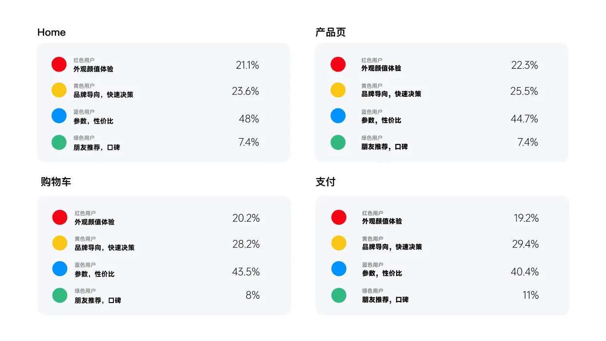
That's the general framing of a page's share.
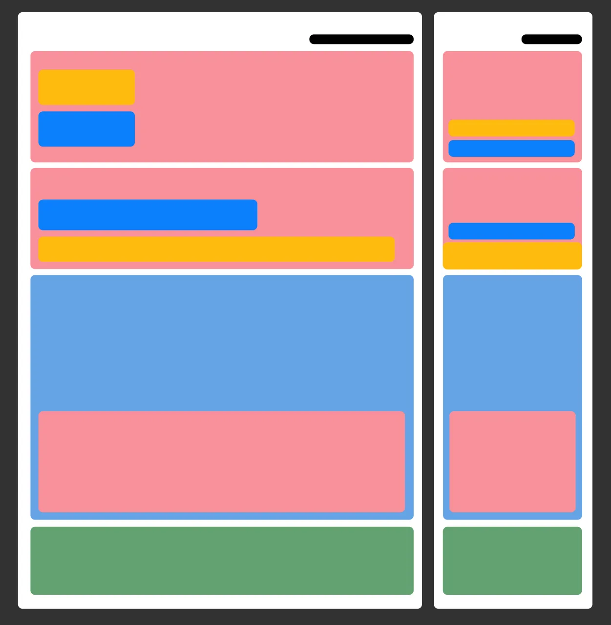
Mistakes are very common with us:
- Too much emphasis is placed on functionality, on advanced performance, and then a higher percentage of visitors are women.
- Too much tuned to face value and service, but the truth is that the predominantly straight users.
- Lower-priced youth models for white-collar oriented users who emphasize high quality and service.
Various examples of errors are very many, when doing design, you can not just see good cases and competitors are doing so, direct fetishism to use. And do not study clearly what your goal, the audience is like.
😊 What we need to achieve is: product positioning + target audience, and an absolute match between the information structure and the user's line of motion!
-
Appearance first, no matter what, put the most beautiful and sophisticated appearance first.
-
Next is trust second, which means that brand certifications, strengths, and safety certifications are given second priority.
-
Function third, look at the details is to run to this, so the display function is very important. If male users are mainly, it is recommended to enlarge the parameters, and core text. If women, the focus is more on solutions, scenes, spokespersons and so on.
-
Finally, the parameters and some other extended reading are placed at the end.
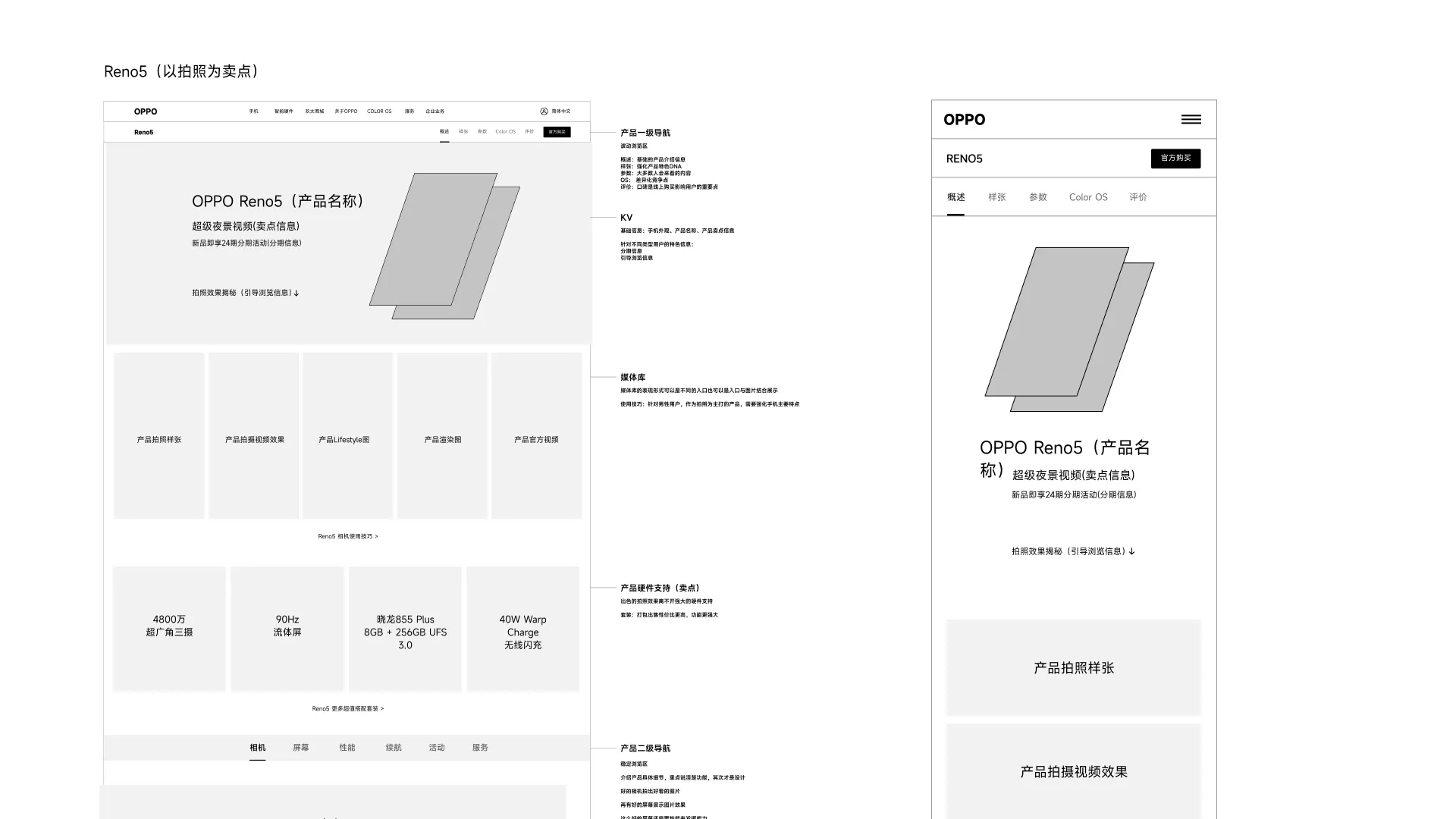
Here is a case illustration
😊 With user prioritization, appearance, trust, functionality, and word of mouth must all be present within the first 2-3 screens of the detail page.
There are bound to be a variety of users who come to visit your page, and while there are tendencies, it is still imperative to give all types of users something to enjoy.
The principles of experience that follow will better illustrate this, especially how users navigate the page.
When faced with a web page, people only read it verbatim if they are truly interested in the content. They usuallyflip(Nielsen), look for keywords that stand out on the page, useful headings, short paragraphs, and easy-to-scan lists. Because of the rush to find the specific information they're looking for, they skip over content that doesn't pertain to them.
-
User Reading Style: Users do not usually read word-for-word on Web pages, but scan the page for information. They pick out individual words and sentences and skim them quickly to find relevant content. This behavior makes users' reading of web pages more efficient, but it also means that much of the content may be overlooked.
-
Stability of scanning behavior: According to eye-tracking studies over the past 13 years, basic scanning behavior of users has remained stable, despite the constant changes in web design. Users tend to scan pages quickly, looking for information that appeals to them.
-
Reading Time Limit: In an average web page visit, users typically only read a maximum of 281 TP3T of text, and in fact are more likely to read only 201 TP3T. This suggests that users have a limited attention span, and that web page design needs to consider how to convey key information in a short period of time.
-
Content Focustogether withActual reading: Users may shift from scanning to actually reading when web content helps them focus on parts of interest. This shift requires good content layout and design to direct the user's attention.
How little do users read?
-
In 2013, data analytics agency Chartbeat looked at Slate, as well as a number of other sites, and found that most visitors only scrolled 50%-60% of the article page.What's more interesting is that there doesn't seem to be a correlation between sharing behaviors and page scrolling-even if they haven't even started to read it yet, people will be happy to share your article as well."You Won't Finish This Article.
-
The scanning and skimming behaviors that develop when browsing large amounts of online content even affect the way we read and understand novels and other long-form printed texts."Serious reading takes a hit from online scanning and skimming, researchers say".
-
Jakob Nielsen's 2008 eye-tracking study showed that web pages on theOnly an average of less than 20% of text is actually readThe
-
In another usability test, Nielsen tested different web copy styles.Simple, easy to scan and objective copywritingLet the availability increase by 124%.
-
Gerry McGovern found in a usability study that a message placed in theLess readily scanned locations on the pageThe result is that only 1 out of 15 users can be found.
-
Steve Krug inDon't Make Me Think.One of the most important truths about website users, according to the bookThey don't read. They just scan.The
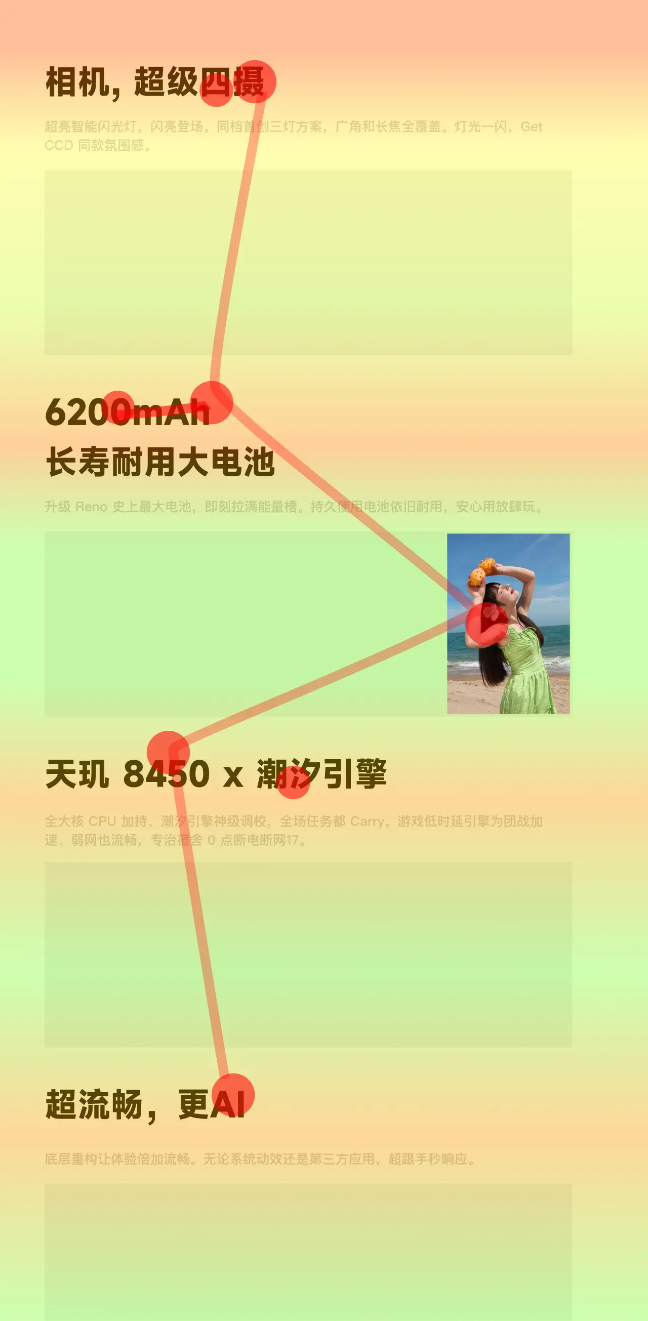
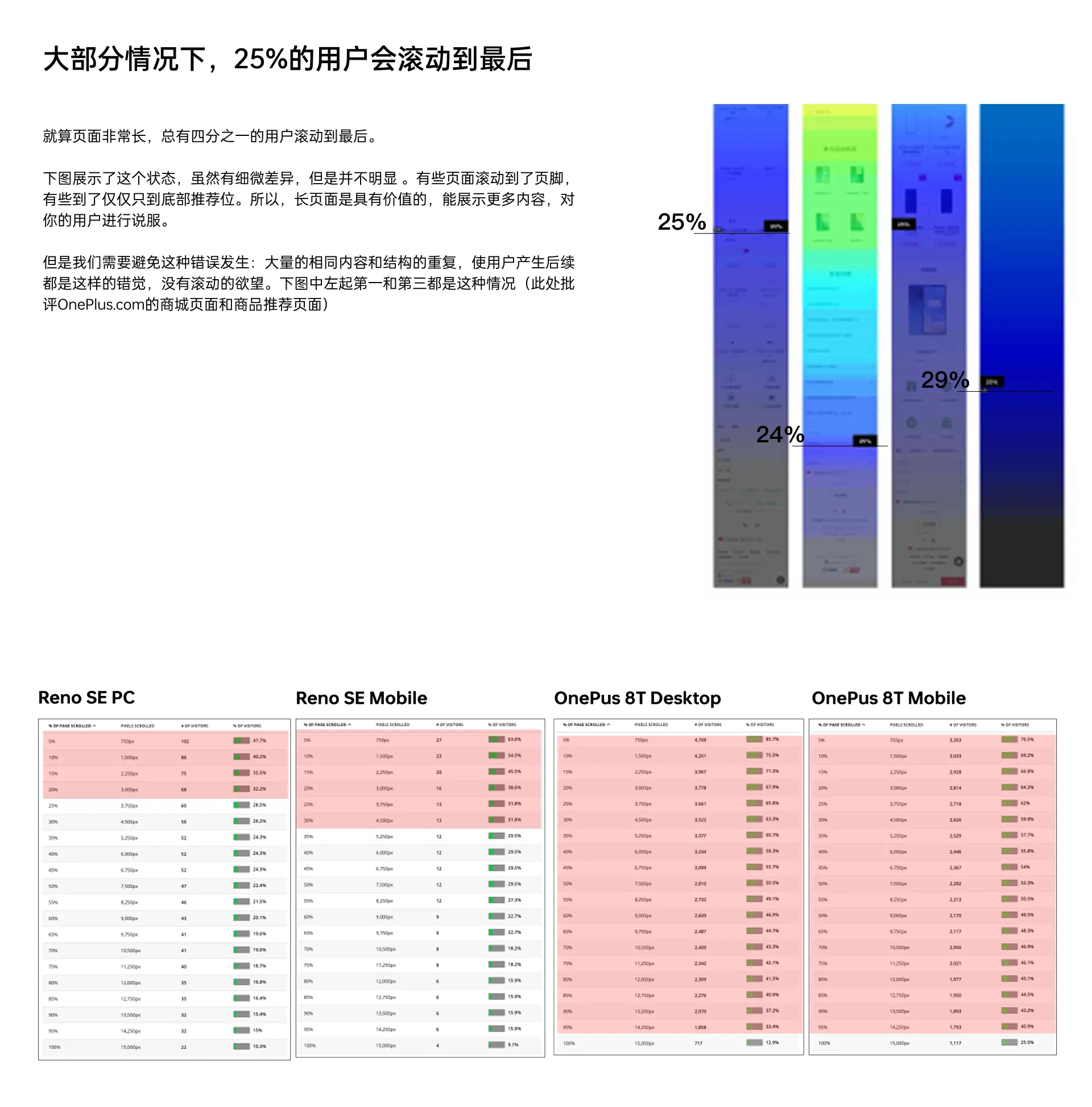
Very many product managers or demand-side, like to put all the content all on the first screen, afraid that others can not see. They think that no one will read the content after the first screen. InMid-1990sPeople aren't used to scrolling pages yet, but it's absolutely natural these days. For continuous and very long content, such as an article or a tutorial, the usability of page scrolling is even better than split page display. So there's no need to squeeze all the content into the top of the homepage or thefirst screen. To make sure people will scroll though, you need to follow certain design principles and have your content consistently entice visitors to read on. It's also important to remember that the first screen of content will still get the most attention, and it's also crucial when users are considering whether your page is worth looking at. Current user habits have become very accustomed to scrolling. Nielsen research shows over 90% of users will scroll after entering a page. How much scrolling occurs afterward is tied to your design.

There are 3 principles that need to be followed in order for the user to continue scrolling down:
1. Avoiding the illusion of completeness
This article details what the illusion of completeness is - Nielsen Norman Group: what is the illusion of completeness in web design and how can it be avoided?https://www.jianshu.com/p/73223d86fb7a
It is important not to have a design where the screen is spread out without any indication, in fact an indication would be better to leave out what is to be scrolled at the beginning. There is a study on scrolling design at the end of this article.
2. Avoid repeating the illusion
When your subsequent content, no change and the structure is exactly the same, the user will quickly establish the perception that you are followed by this, nothing to see. So when designing long pages, be sure to appear clever with some variation, whether it's the structure or the content itself. Better yet, add interest within at the right scrolling cliffhanger.
3, the most important one, is the content structure to attract users, and timely placement of good content at the cliff.
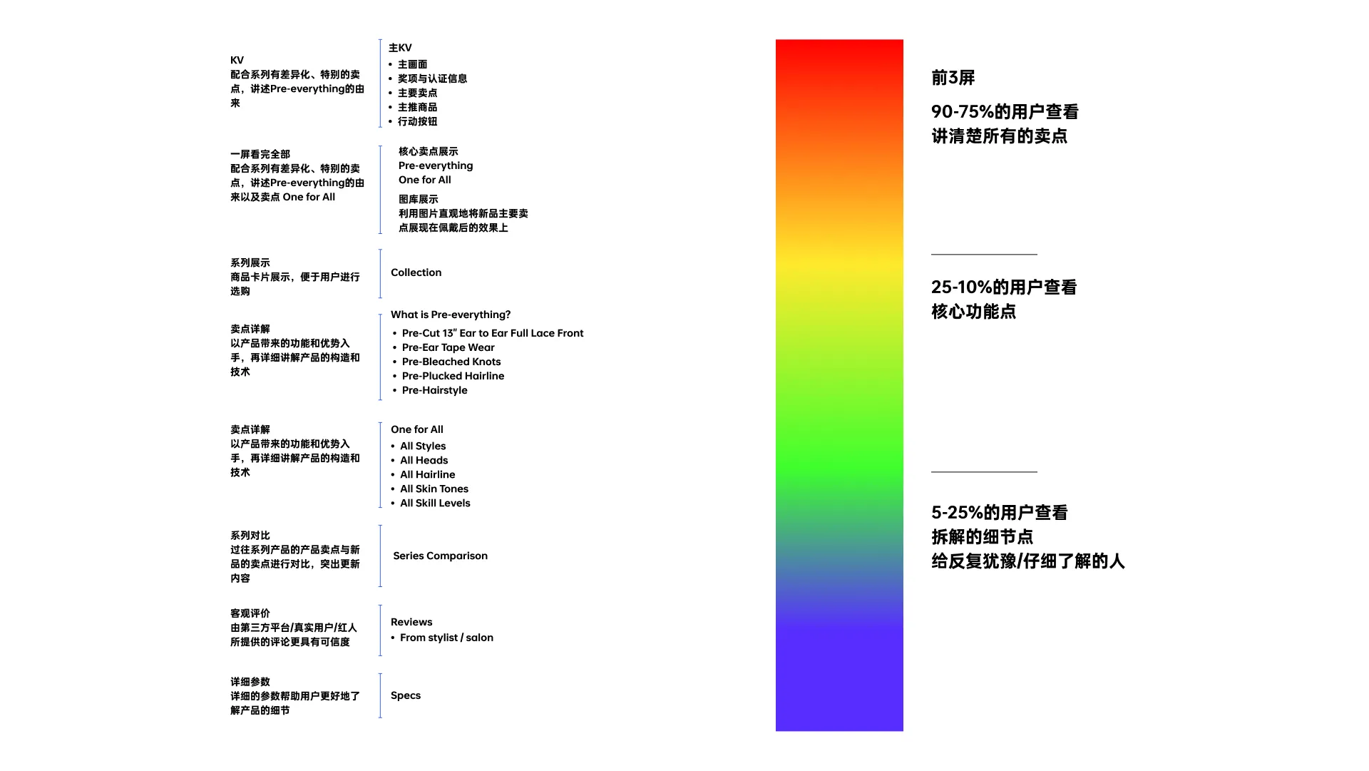
As you can see in the chart below, the drop in content is very noticeable.

So now the digital page formula is: first screen image (appearance + price + core selling points) + second - third screen (main selling points with core appearance) + subsequent screens (big headline + parameters + appearance). Such a structure can basically stabilize the scroll down very quickly. Digital products tend to look at the function of cost-effective and appearance-based, the above structure is very effective.

You need to build your rolling strategy based on your product.
-
KSP users will stay and read;
-
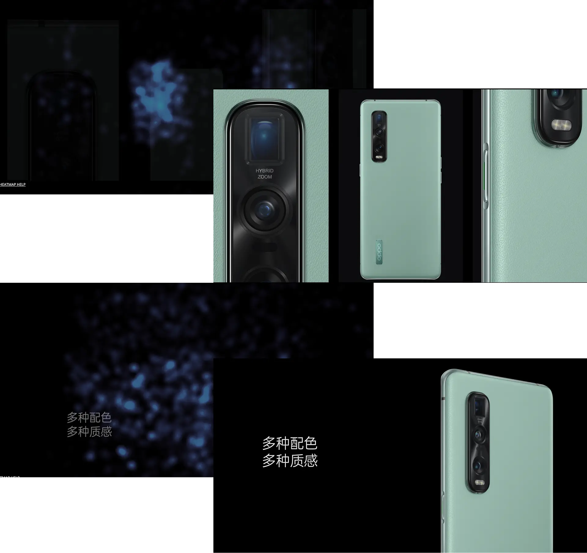
Parameters will be the key area to stay, such as 5000mAh capacity, 100W fast charging, and 256GB of ultra-large RAM;
-
The color toggle selection will make most users stay and click on the toggle;
-
Focusing on the appearance of the concern, such as the details of the leather, the lens module will be of extra interest to the user;
-
Showing the interface part of the product, the user will look closely at the interface - he wants to know the details of the function operation inside;
-
Trusted and authentic content would be better;
-
Objective facts and observations are more important than subjective statements
-
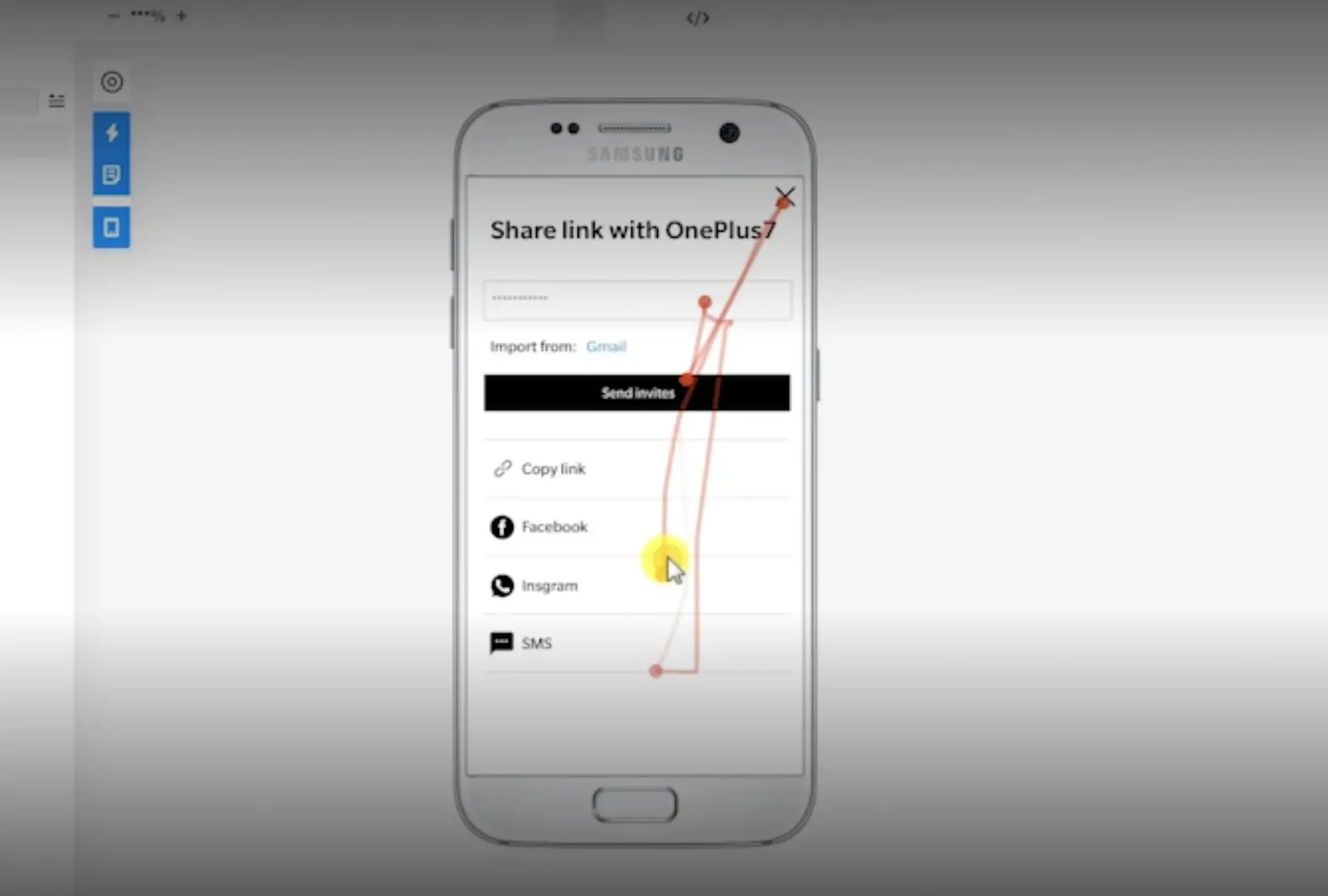
Being able to see heat maps and recordings of operations is optimal
-
Pre-categorization of users
-
Where did the attempt click and what action did it do?
-
What's his rolling speed like?
-
How did he read it? What information made a stop
-
What information did he manipulate?
-
Is it a smooth operation?
-
Have him describe what this detail says.
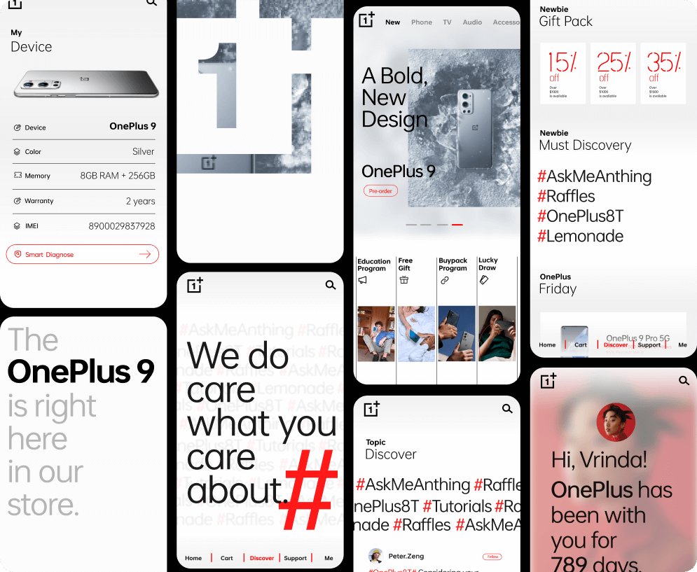
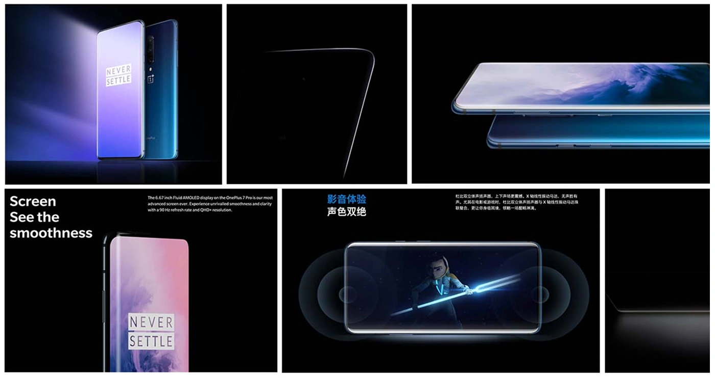
In ONEPLUS 7 Pro, a complete symmetrical, full-screen phone with no perforations. We wanted to express the complete aesthetics of the phone, a kind of perfect proportions and body sensuality.
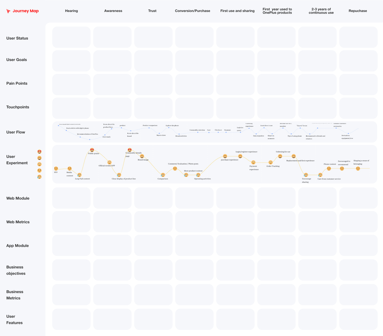
Always consider conversion funnels + user journeys during the design process so that the design balances user experience and business goals.
We need great user journeys that are highly linked to the business modules, fit with the business goals, and also describe the user experience and user goals.
Any project will be a part of the user journey, which stage are you solving? Which business metrics will be improved? What kind of user experience is predicted to be improved? Design isn't blind design, it's informed design.
Only by maintaining efficient communication can we continuously optimize and solve problems.
- Maintain communication with the business side to know if the conversion funnel is being met, meet business goals, and clear the fog of information;
- Often keep in communication with other designers and have people critique to avoid blind spots in your thinking;
- Have other people look at it often and keep it in a state of "usability testing" at all times;
Objective, problem-solving, and better user experience is what we're after, and by maintaining a constant openness to design, you'll be able to design at an increasingly superior level.
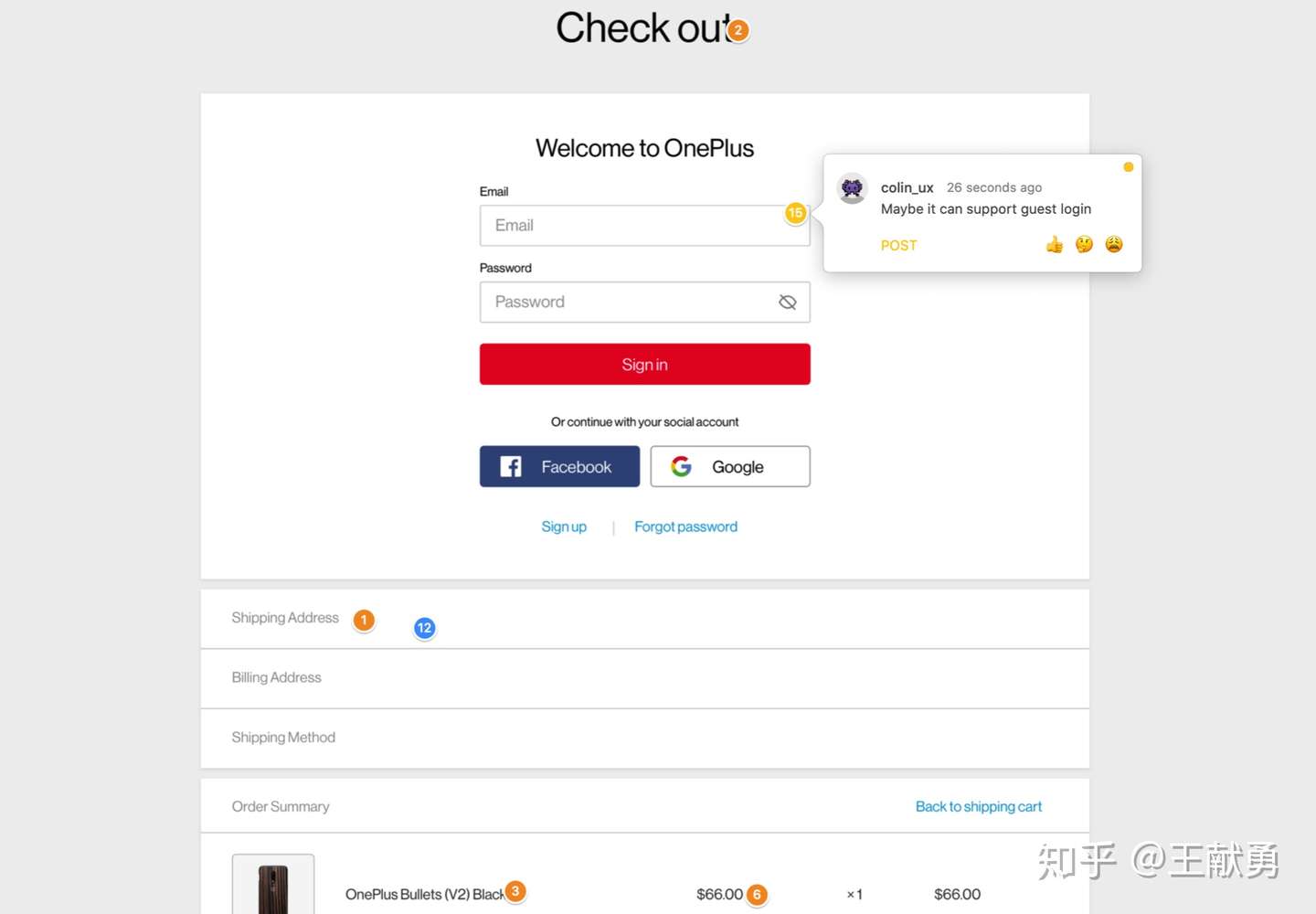
The following is a sort of user impression tracing points:
Interactive Effects Design: AE+Principle
