非常多的产品经理或者需求方,都喜欢把所有内容都全部放在第一屏,生怕别人看不到。认为第一屏之后的内容就不会有人看了。
在Mid-1990s人们还不习惯滚动页面,但如今滚动页面绝对是很自然的事情。对于连续且篇幅很长的内容,比如一篇文章或一个教程,页面滚动的可用性甚至比分页显示更好。
所以不必把所有的内容都挤到主页的顶部或first screen。不过为了确保人们会滚动,你需要遵循一定的设计原则,并且要让你的内容可以持续地吸引访问者读下去。同时要记住,第一屏的内容仍然会得到最多的注意力,而且当用户在考虑你的页面是否值得一看的时候,它也是至关重要的。
当前的用户习惯已经非常的习惯滚动。尼尔森的研究表明超过90%的用户会在进入页面后发生滚动。
后面的内容滚动多少和你的设计息息相关。
There are 3 principles that need to be followed in order for the user to continue scrolling down:
1. Avoiding the illusion of completeness
This article details what the illusion of completeness is - Nielsen Norman Group: what is the illusion of completeness in web design and how can it be avoided?https://www.jianshu.com/p/73223d86fb7a
It is important not to have a design where the screen is spread out without any indication, in fact an indication would be better to leave out what is to be scrolled at the beginning. There is a study on scrolling design at the end of this article.
2. Avoid repeating the illusion
When your subsequent content, no change and the structure is exactly the same, the user will quickly establish the perception that you are followed by this, nothing to see. So when designing long pages, be sure to appear clever with some variation, whether it's the structure or the content itself. Better yet, add interest within at the right scrolling cliffhanger.
3, the most important one, is the content structure to attract users, and timely placement of good content at the cliff.
As you can see in the chart below, the drop in content is very noticeable.
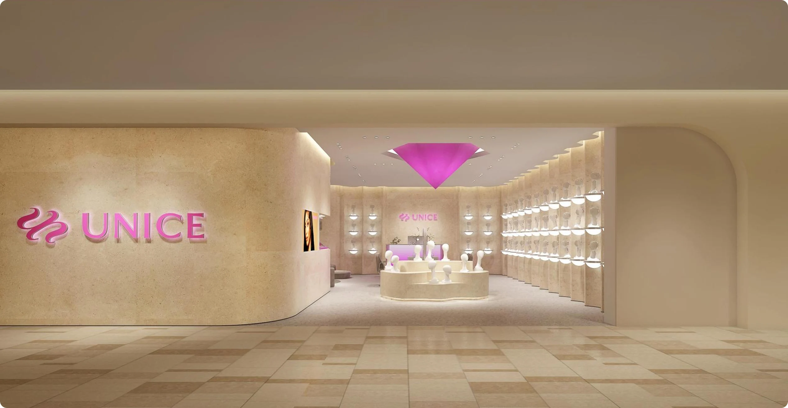
因此现在数码页面公式是:第一屏图(外观+价格+核心卖点)+第二屏-第三屏(主要卖点与核心外观)+后续几屏(大标题+参数+外观)。这样的结构基本能很快稳住滚动的下跌。
数码类产品往往都是看中功能性价比和外观为主,上面这个结构非常有效。
You need to build your rolling strategy based on your product.